A 60 SECOND GLANCING EYE ON BUSINESS, MARKETS & ECONOMY

Global Markets


Live World Indices are powered by Investing.com

Friday, 5 February 2016

ALERT: Oil Prices Set to Rise Sharply


Oil Production Going to Drop; Oil Prices Likely To Increase


The two below Rystad charts were published by CNN Money on November 23, 2015.

Costs, Overall
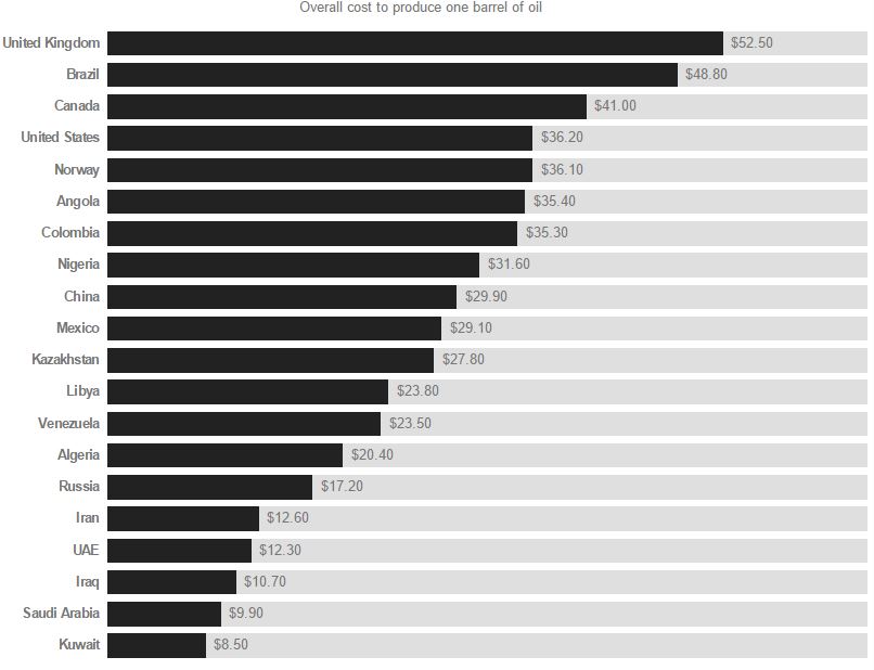
This is overall or average cost, not marginal cost. It cost Canada $41 to produce a barrel of oil but only cost Russia $17.20. I guess that is why Canada is cutting back but Russia is not.
Costs, Breakdown

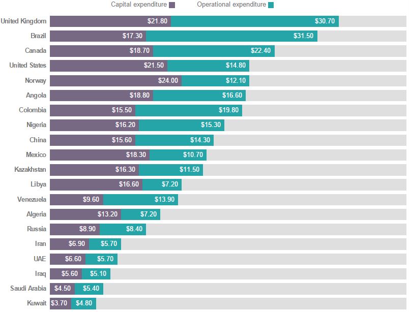
 Here is the breakdown between capital expenditures and operational expenditures. Why would the United Kingdom’s operational expenditures be two and one half times those of Norway? After all, they are both drilling basically the same oil field.
So why is not the price of oil having a more dramatic effect on production? Well it is, it just takes a while. Here are some plans from about a year and a half ago, when the price of oil was much higher.
Rystad published the two below charts in their US Shale Newsletter in January 2015 but the data dates from the 4th quarter of 2014, just as the price of oil had started to drop.

Cost per Play
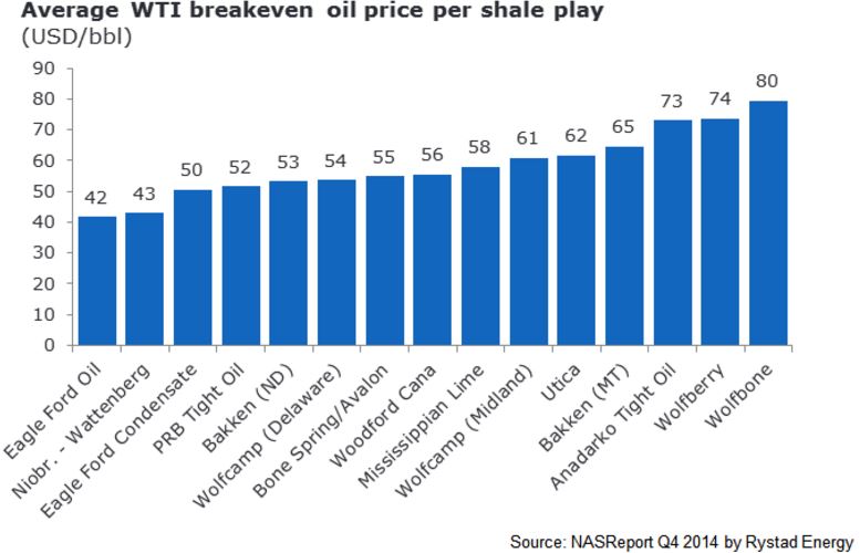
At that time Bakken (ND) had a break even price of $53 while Eagle Ford oil had a break even price of $42 and Eagle ford condensate a break even price of $50.
The below chart, from the same newsletter, assumes $90 a barrel oil.

Costs, Startup
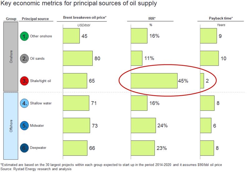
Shale oil, at the time, had an average break even price of $65 a barrel, which would have given them a 45% internal rate of return and a payback time of only 2 years. It is amazing how much things have changed in just a little over a year.
But by October 2015 things had changed dramatically.
Global offshore oil production in aging fields will fall by 10 percent next year as producers abandon field upgrades at the fastest rate in 30 years, in the first clear sign of output cuts outside the U.S. shale industry, exclusive data shows.
A drop in oil prices to half the level of a year ago has forced producers to slash spending and scrap mega projects that can take up to a decade to develop, but they are also taking less visible steps to cut investment in existing fields that will have an immediate impact on global supplies.
There have been few signs of how cost cuts of around $180 billion will impact near-term production until now. They could erode the glut that has forced down prices, and help balance global production and demand by the middle of next year or earlier, Oslo-based oil consultancy Rystad Energy said.
Data provided exclusively to Reuters by Rystad show a sharp decline in investment to upgrade mature offshore oil fields in order to arrest their natural decline, in what is known as infill drilling.(Graphic: link.reuters.com/xaz75w)


Costs, Infill Drilling Decline
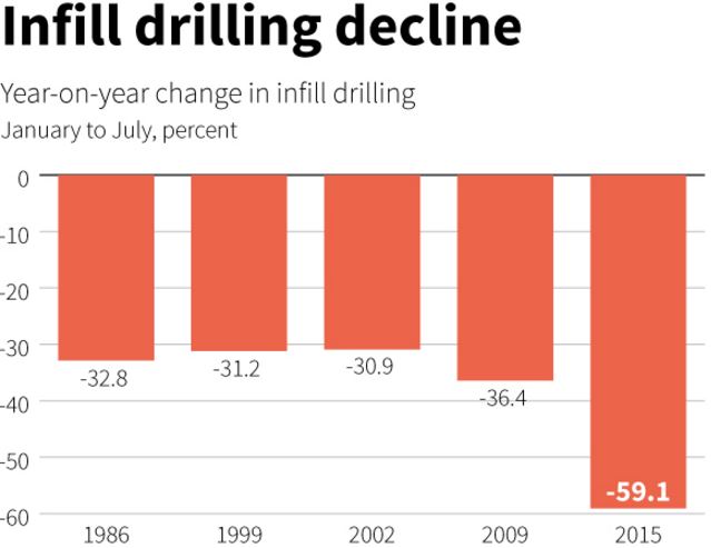
The above chart shows the decline in infill drilling due to previous drops in the price of oil. The data is from the Gulf of Mexico, Southeast Asia and Brazil. The decline in infill drilling in 2009 was the largest… until now. The first half of 2015 saw the largest decline in offshore infill drilling in history.
In three major offshore basins — the Gulf of Mexico, Southeast Asia and Brazil — infill drilling dropped by 60 percent between January and July this year compared with the same period last year, according to the Rystad Oil Market Trend Report, whose data is based on company data and regulatory filings.
For example, according to the data, in the Gulf of Mexico, infill drilling on mature wells dropped from 149 wells between January and July 2014 to a total of 61 wells during the same period this year.
Based on this trend, Rystad Energy estimates that global offshore oil production in mature field will decline next year by 1.5 million barrels per day (bpd), or 10 percent, to 13.5 million bpd from 15 million bpd in 2015.

Costs Infill drilling 1
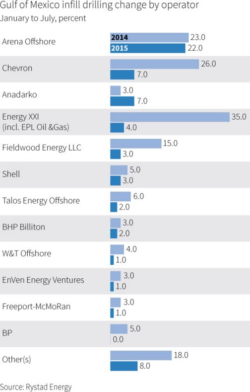
The above chart is change per operator, just in the GOM. And this was just in the first half of 2015 when the price of oil averaged about $56 a barrel. What is it now when the price of oil is over $20 a barrel lower?
Well, just since June Wood Mackenzie says the latest figures show that the amount of deferred capital spending on projects awaiting approval has almost doubled from $200bn to $380bn, with 2.9m barrels a day of liquids production now not due to come on stream until early in the next decade.
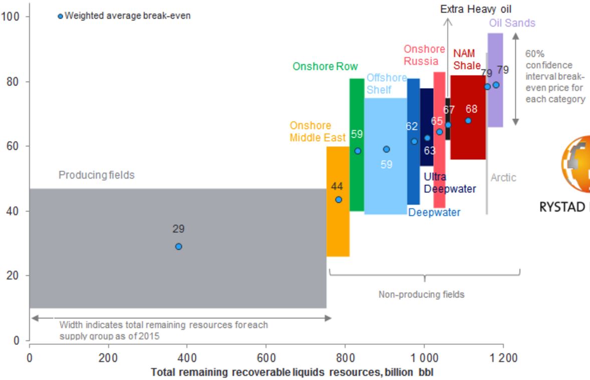
*The break-even price is the Brent oil price at which NPV equals zero using a real discount rate of 7.5%. Resources are split into two life cycle categories: producing and non-producing (under development and discoveries). the latter is further split into several supply segment groups. The curve is made up of more than 20,000 unique assets based on each asset’s break-even price and remaining liquids resources in 2015.
Source: Rystad Energy UCube September 2015


What the above chart tells me is that it now costs a lot more to produce a barrel than it once did. And… unless crude oil hits at least $60 a barrel soon a lot more projects will have to be cancelled. But… all that being said, I think it is now obvious that oil production will drop, rather dramatically, beginning sometime in 2016. And that drop will lead to a rise in the price of oil, at least to $60 a barrel and likely higher.

That is unless some black swan event happens. That could be a collapse in several economies of the world… or a collapse of the economy in one country, China. In other words, it is a given that production is going to decline. So if demand stays constant, or rises, then the price of oil will definitely rise. We know what is going to happen to supply. We have no idea what is going to happen to demand.

 But if BAU continues as normal, the price of oil is going up.


"Now is there anything else that we should worry about?" 

Jack Feanhald, WWN News

Image result for skyrocketing 0il prices


An Important Video Worth Watching


Friday, 29 January 2016

Energy 2050 Apocalypse - The Road to Exhaustion (Part 5)

Energy 2050 Apocalypse


World Energy to 2050
  Forty Years of Decline
Renewable Energy
Part 5
By Paul Cherfurka
http://www.paulchefurka.ca/

Renewable Energy


Renewable energy includes such sources as wind, photovoltaic and thermal solar, tidal and wave power, biomass etc. Assessing their probable contributions to the future energy mix is one of the more difficult balancing acts encountered in the construction of the model. The whole renewable energy industry is still in its infancy. At the moment, therefore, it shows little impact but enormous promise. While the global contribution is still minor (at the moment non-hydro renewable technologies supply about 1% of the world's total energy needs) its growth rate is exceptional. Wind power, for example, has experienced annual growth rates of 30% over the last decade, and solar power is doing about as well, though from a lower starting point.

Proponents of renewable energy point to the enormous amount of research being conducted and to the wide range of approaches being explored. They also point out correctly that the incentive is enormous: the development of renewable alternatives is crucial for the sustainability of human civilization. All this awareness, work, and promise give the nascent industry an aura of strength verging on invincibility, which in turn supports a conviction among its promoters that all things are possible.

Of course, the real world is full of unexpected constraints and unwarranted optimism. One such constraint has shown up in the field of biofuels, where a realization of the conflict between food and fuel has recently broken through into public consciousness. One can also see excessive public optimism at work in the same field, where dreams of replacing the world's gasoline with ethanol and biodiesel are now struggling against the limits of low net energy in biological processes.


The key questions in developing a believable model are, what is the probable growth rate of renewable energy over the next 50 years, and what amount of energy will it ultimately contribute?  I do not subscribe to the pessimistic notion that renewables will make little significant contribution.  However, I think it's equally unrealistic to expect that they will achieve a dominant position in the energy marketplace, due to their late start and their continuing economic disadvantage relative to coal.

In order to project realistic growth rates for renewable energy sources I have used the same mathematical approach as I used for hydro. Data on recent global production of wind, solar photovoltaic and other forms of renewable energy was used as the starting point for the projections. Excel trend lines were fitted to the data and the equations generated in the process were used to extrapolate the growth of each source.  As we saw previously, the closeness of the fits as demonstrated by the R-squared values on the graphs gives a certain  degree of confidence in the projections.

These projections should be treated with a great deal of caution.  Because both the wind and solar power industries are still so new, it is possible that they may exhibit higher growth rates in the future, thus making the following projections too conservative. On the other hand they may run into unexpected constraints that would skew the outcome in a more pessimistic direction. Due to the youth of the industry there is very little historical production data to use in establishing the trends.  This scarcity of data makes statistical projections less trustworthy, as large discontinuities in production from year to year may render the curve fits unreliable.  On the other hand, there is at least some basis for the projections beyond the enthusiasm of the proponents or the gainsaying of their detractors.  The projections should be regarded more as thought experiments - do they seem reasonable given your own assumptions of how the energy world works?  If they seem unreasonable (either too high or too low), what is the evidence that will dispute them?


Wind


Data on the global production of wind energy from 1997 to 2005, collected by the World Wind Energy Association and reprinted inthis graphic, was used as the starting point for the projection shown in Figure 8. The closeness of the fit of the calculated curve to the actual production data, as indicated by the R-squared value of .998, gives us a reasonable degree of confidence in the projection.


Figure 8: Actual and Projected Wind Power, 1997 to 2050


There are a number of factors that may act on the future development of wind power.  There is no doubt that it is an attractive replacement for coal or gas-fired electricity generation, at least within the limits imposed by the inherent variability of wind power.  If that limitation can be addressed, either through cheaper energy storage techniques to bridge periods of low wind or smart grids that can tolerate larger amounts of variable power, a significant constraint to rapid and extensive wind development may be removed.  The other potential constraint is the ever-present threat of oil and natural gas depletion.  The rising cost of oil and gas may drive the cost of industrial production of all kinds up sharply before wind power has achieved a significant presence.
As in the case of nuclear power there will be pressures to speed up the development of wind power because of global warming and the depletion of oil and gas, as well as restraining forces imposed by economics, technical feasibility and perhaps some public resistance to having turbines in their neighborhood.

All in all, with a projected growth of 2200% from now until 2050 it looks as though wind is the renewable energy source that will make the most difference to the world's energy mix over the next 50 years.

Solar Photovoltaic


The data for actual solar photovoltaic production were compiled from herehere and here.  This time, a third order polynomial was used to project the historical trend based on data from 1996 to 2006, and once again the fit is good enough to give some confidence that the observed trend is real.  Though the growth of solar power in percentage terms is spectacular (an increase of 12,000% by 2050), given the lower starting point the contribution of solar power in 2050 will amount to only half that of wind.  However, wind and solar technologies are different enough in their application that this amount of solar power should make a dramatic difference in the lives of many around the world.


Figure 9: Actual and Projected Solar Power, 1996 to 2050


Other Renewables


In the category of "other renewables" we have such sources as geothermal, biomass, tidal power etc. Production figures for these sources were obtained from the  Energy Information Agency.  After removing the contribution of wind power from the aggregated figures, the historical production was again projected mathematically. In this case a linear trend line provided the best fit, which seems sensible - biomass is the largest contributor, and it is a very mature energy source, unlikely to exhibit exponential growth in the near future.


Figure 10: Other Renewable Energy Production, 1990 to 2100


Wednesday, 30 December 2015

Energy 2050 Apocalypse - The Road to Exhaustion (Part 4)

Energy 2050 Apocalypse


World Energy to 2050
  Forty Years of Decline
Our Energy Sources
Part 4
By Paul Cherfurka
http://www.paulchefurka.ca/


Coal


Coal is the ugly stepsister of fossil fuels. It has a terrible environmental reputation, going back to its first widespread use in Britain in the 1700s. London's coal-fired "peasoup" fogs were notorious, and damaged the health of hundreds of thousands of people. Nowadays the concern is less about soot and ash than about the acid rain, mercury and especially carbon dioxide that results from burning coal. For the same amount of energy released, coal produces more CO2 than either oil or gas. From an energy production standpoint coal has the advantage of very great abundance. Of course that very abundance is a huge negative when considered from the perspective of global warming.


Most coal today is used to generate electricity. As economies grow, so does their demand for electricity.  The need to use electricity to replace some of the energy lost due to the decline of oil and natural gas will put yet more upward pressure on the demand for coal. At the moment China is installing two to three new coal-fired power plants per week, and has plans to continue at that pace for at least the next decade.

Just as we saw with oil and gas, coal will exhibit an energy peak and decline, though for different reasons. One important factor in the eventual decline of the energy obtained from burning coal is that we have in the past concentrated on finding and using the highest grade of coal: anthracite. Much of what remains consists of lower grade bituminous and lignite. These grades of coal produce less energy when burned, and require the mining of ever more coal to get the same amount of energy.

In addition to their exemplary study of oil supplies mentioned above, the Energy Watch Group has also conducted an extensive analysis of coal use over the next century.  I have adopted their "best case" conclusions for this model. The model projects a continued rise in the use of coal to a peak in 2025. As global warming begins to have serious effects there will be mounting pressure to reduce coal use.  

Unfortunately, due to its abundance and our need to replace some of the energy lost from the depletion of oil and gas, the decline in coal use will not be as dramatic as seen with those fossil fuels. The model has coal use decreasing evenly from its peak to a production level similar to what it is today, giving the curve shown in Figure 5.


Figure 5: Global Coal Production, 1965 to 2050

Of course the increased use of coal carries with it the threat of increased global warming due to the continued production of CO2. Many hopeful words have been written about the possibility of alleviating that worry by implementing Carbon Capture and Storage. CCS usually involves the capture and compression of CO2 from power plant exhaust, which is then pumped into played-out gas fields for long term storage. This technology is still in the experimental stage, and there is much skepticism surrounding the security and economics of storing such enormous quantities of CO2 in porous rock strata.

Hydro


If coal is the ugly stepsister, hydro is one of the fairy godmothers of the energy story. Environmentally speaking it's relatively clean, if perhaps not quite as clean as once thought. It has the ability to supply large amounts of electricity quite consistently. The technology is well understood, universally available and not too technically demanding (at least compared to nuclear power). Dams and generators last a long time.


It has its share of problems, though they tend to be quite localized. Destruction of habitat due to flooding, the release of CO2 and methane from flooded vegetation, and the disruption of river flows are the primary issues. In terms of further development the main obstacle is that in many places the best hydro sites are already being used. Nevertheless, it is an attractive energy source.


Figure 6: Global Hydro Production, 1965 to 2050

Development will probably continue in the immediate future at a similar pace as in the past.  The model for hydro power has its capacity increasing by almost 40% by 2050. This projected growth is gradually constrained toward the middle of the century by two main factors: most useful river sites are already in use, and water flows will gradually be reduced due to global warming.  There may also be a general loss of global industrial capacity (and/or rising development costs) due to oil and gas depletion.  Nevertheless, the pressure on hydro power to replace energy lost from oil and gas depletion will support continued development even in the face of such constraint.


Nuclear


The graph in Figure 7 is a mix of data synthesis with a bit of projection. I started with a table of reactor ages from the IAEA (reprinted in a presentation to the Association for the Study of Peak Oil and Gas), the table of historical nuclear power production from the BP Statistical Review of World Energy 2007 and a table from the Uranium Information Centre showing the number of reactors that are installed, under construction, planned or proposed worldwide.


The interesting thing about the table of reactor ages is that it shows the vast majority of the world's operating reactors (361 out of 439 or 82% to be precise) are between 17 and 40 years old. The number of reactors at each age varies of course, but the average number of reactors in each year is about 17. The number actually goes over 30 in a couple of years.


Two realizations formed the basis for my model of nuclear power. The first was that reactors have a finite lifespan averaging around 40 years, which means that a lot of the world's reactors are rapidly approaching the end of their useful life. The second realization was that the construction rate of new reactors and their average capacity can be inferred from the UIC planning table.We can therefore calculate the approximate world generating capacity with reasonable accuracy out to 2030 or so.


The model takes a generous interpretation of the available data. It assumes we will build all the reactors shown in the UIC data referenced above: six plants per year for the next five years, nine plants per year for the subsequent ten years, and ten plants per year until 2050. The model further assumes that all reactors will be granted life extensions to 50 years from their current 40, and that no plants will be prematurely decommissioned.  It also assumes that each plant generates an average output equivalent to 1.53 Mtoe per year. The derivation of this figure is given in the model data available here.


Figure 7: Global Nuclear Production, 1965 to 2100

The drop in output between 2020 and 2037 is the result of new construction not keeping pace with the decommissioning of old reactors. The argument for a peak and subsequent decline in nuclear capacity is very similar to the logistical considerations behind Peak Oil - the big pool of reactors we currently use will start to become exhausted, and we're not building quite enough replacements.  The rise after 2037 comes from my estimate that we will then be building 10 reactors per year compared to 6 per year today. The net outcome is that in 2050 nuclear power will be supplying about the same amount of energy that it is today.

A number of factors may act to increase that output.  Those changes could include the uprating of existing reactors to produce more power than their original design specification, an increase in the size of future reactors and/or a building boom prompted by concerns about global warming and the decline of oil and gas supplies.

Restraining the increase will be economic factors (construction will become more expensive as oil and gas deplete, driving up the cost of materials and transportation), and continuing public opposition to nuclear power plants, waste storage and uranium mining.  At some point uranium mining itself may also become a bottleneck - the current world production of about 50,000 tonnes of uranium per year could need to increase to around 70,000 tonnes per year in order to fuel the increased number of reactors.  Of course the amount of additional uranium required will depend entirely on the number of new plants that actually get built.


A number of advanced reactor technologies are presently under investigation or development, including high energy "fast reactors" that produce less waste, reactors that can use more abundant and cheaper thorium as a fuel, and "pebble bed" designs that promise improved safety.  None of these technologies are commercially available (and are unlikely to be within the next decade or two), so they have not been incorporated into the model.

Friday, 27 November 2015

Energy 2050 Apocalypse - The Road to Exhaustion (Part 3)

Energy 2050 Apocalypse


World Energy to 2050
  Forty Years of Decline
Our Energy Sources
Part 3

By Paul Cherfurka
http://www.paulchefurka.ca/

Our Energy Sources

Oil


The analysis of our oil supply starts from the recognition that it is finite, non-renewable, and subject to effects which will result in a declining production rate in the near future. This situation is popularly known as Peak Oil. The key concept of Peak Oil is that after we have extracted about half the total amount of oil in place the rate of extraction will reach a peak and then begin an irreversible decline.
This peak and decline happens both for individual oil fields and for larger regions like countries, but for different reasons. In individual oil fields the phenomenon is caused by geological factors inherent to the structure of the oil reservoir. At the national or global level it is caused by logistical factors. When we start producing oil from a region, we usually find and develop the biggest, most accessible oil fields first. As they go into decline and we try to replace the lost production, the available new fields tend to be smaller with lower production rates that don't compensate for the decline of the large fields they are replacing.
Oil fields follow a size distribution consisting of a very few large fields and a great many smaller ones. This distribution is illustrated by the fact that 60% of the world's oil supply is extracted from only 1% of the world's active oil fields. As one of these very large fields plays out it can require the development of hundreds of small fields to replace its production.
The theory behind Peak Oil is widely available on the Internet, and some introductory references are given herehere and here.  In addition, the German organization Energy Watch Group provides an exceptionally comprehensive (but still accessible) overview of the topic in the Executive Summary of their recently released study of Peak Oil.


Timing


There is much debate over when we should expect global oil production to peak and what the subsequent rate of decline might be. While the rate of decline is still hotly contested, the timing of the peak has become less controversial. Recently a number of very well informed people have declared that the peak has arrived. This brave band includes such people as billionaire investor T. Boone Pickens, energy investment banker Matthew Simmons (author of the book "Twilight in the Desert" that deconstructs the state of the Saudi Arabian oil reserves), retired geologist Ken Deffeyes (a colleague of Peak Oil legend M. King Hubbert) and Dr. Samsam Bakhtiari (a former senior scientist with the National Iranian Oil Company).  This view is also supported by the extremely detailed analysis published by the Energy Watch Group mentioned above.
My position is in agreement with these luminaries: the peak is happening as I write these words (in late 2007). I have confirmed its occurrence to my own satisfaction by examining the pattern of oil production and oil prices over the last three years. I discovered in the process that crude oil production peaked in May 2005 and has shown no growth since then despite a doubling in price and a dramatic surge in exploration activity.

Decline Rate


The post-peak decline rate is another question. The best guides we have are the performances of oil fields and countries that are known to be already in decline. Unfortunately, those decline rates vary all over the map. The United States, for instance, has been in decline since 1970 and has lost 40% of its production capacity since then, for a decline rate of about 2% per year. On the other hand, the North Sea basin is showing an annual decline around 10%, and the giant Cantarell field in Mexico is losing production at rates approaching 20% per year.
In order to create a realistic decline model for the world's oil, I have chosen to follow the approach of the Energy Watch Group, which is similar in profile to the projections of Dr. Bakhtiari in his WOCAP model . Both assume a gradually increasing decline rate over time, starting off very gently and ramping up as the years go by. The main difference is that the EWG model is slightly less aggressive than WOCAP. WOCAP predicts that production will fall from its current value of 4000 million tonnes of oil per year (Mtoe/yr) to 2750 Mtoe/yr in 2020, while the EWG projects a decline to 2900 Mtoe/yr by then.  The EWG projects an oil supply of just under 2000 Mtoe in 2030.  My model projects a decline rate increasing from 1% per year in 2010 to a constant rate of 5% per year after 2025, resulting in an average decline rate of 4% per year between now and 2050.  In 2050 oil production is only 18% of what it is today, as shown in Figure 1.


Figure 1: Global Oil Production, 1965 to 2050


Keep in mind that Peak Oil is primarily a transportation fuel problem.  Almost 70% of the world's oil is used in transportation as gasoline, diesel fuel, jet fuel and bunker fuel for ships.  Right now there is a lot of excitement surrounding the development of electric cars.  However, the immediacy of the peak and the slope of the following decline suggest that it may prove difficult to replace enough of the global automobile fleet in the time available to maintain the ubiquitous personal mobility we have become used to.  Europe and Asia are placing a lot of emphasis on electrifying inter-city rail and urban mass transit.  Rail electrification seems like a sensible initiative that should be pursued urgently by all nations.

Natural Gas


The supply situation with natural gas is very similar to that of oil. This similarity makes sense because oil and gas come from the same biological source and tend to be found in similar geological formations. Gas and oil wells are drilled using very similar equipment. The differences between oil and gas have everything to do with the fact that oil is a viscous liquid while natural gas is, well, a gas.

While oil and gas will both exhibit production peaks, the slope of the post-peak decline for gas will be significantly steeper due to its lower viscosity. To help understand why, imagine two identical balloons, one filled with water and the other with air. If you set them down and let go of their necks, the air-filled balloon will empty much faster than the one filled with water. Even though oil and gas reservoirs are made up of porous rock rather than being big pockets of liquid or gas, they behave in much the same way.Because of its viscosity, oil reservoirs often require their internal pressure to be raised over time by pumping in water, in order to force out the oil and maintain their flow rates. In contrast, when a gas reservoir is pierced by the well, the gas flows out rapidly under its own pressure. As the reservoir empties the flow can be kept relatively constant until the gas is gone, when the flow will suddenly stop.

Image result for oil exhaustion

Gas reservoirs show the same size distribution as oil reservoirs. As with oil, we found and drilled the big ones, in the most accessible locations, first. The reservoirs that are coming on-line now are getting progressively smaller, requiring a larger number of wells to be drilled to recover the same volume of gas. For example, the number of gas wells drilled in Canada between 1998 and 2004 went up by 400% (from 4,000 wells in 1998 to 16,000 wells in 2004), while the annual production stayed constant. These considerations mean that the natural gas supply will exhibit a similar bell-shaped curve to what we saw for oil.  In fact, the production of natural gas peaked in the United States in 2001, and in Canada in 2002.  In addition, the remaining large gas and oil deposits are in less and less accessible locations, making the extraction of their reserves slower and more expensive.

One other difference between oil and gas is the nature of their global export markets. Compared to oil, the gas market is quite small due to the difficulty in transporting gases compared to liquids. While oil can be simply pumped into tankers and back out again, natural gas must first be liquefied (which takes substantial energy), transported in special tankers at low temperature and high pressure, then re-gasified at the destination which requires yet more energy. As a result most of the world's natural gas is shipped by pipeline, which pretty well limits gas to national and continental markets. This constraint has an important implication: if a continent's gas supply runs low it is very difficult to supplement it with gas from somewhere else that is still well-supplied.

The peak of world gas production may not occur until 2025, but two things are sure: we will have even less warning than we had for Peak Oil, and the subsequent decline rates may be shockingly high.  I have chosen 2025 as the global peak (20 years after Peak Oil).  The peak is followed by a rapid increase in decline to 10% per year by 2050, for an average decline rate of 6% per year. In 2050 gas production is projected to be only 24% of its current value.  The production curve for natural gas is shown in Figure 4.


Figure 4: Global Natural Gas Production, 1965 to 2050

One of the big concerns regarding a decrease in global natural gas supplies has to be about its role in the production of ammonia for fertilizer.  Currently 4% of the world's natural gas is used for fertilizer production (the largest uses are as industrial and residential heat sources, and for electricity generation).  As the gas supply declines the price will automatically rise and fertilizer prices will go along for the ride.  Rising fertilizer prices will have dire consequences in a world whose expanding population needs to be fed, where much of the land would not be able to sustain its current production levels without artificial fertilizer, and where the largest population increases will occur in the poorest nations with the least productive soils.


It is possible to produce the hydrogen required to make ammonia (the feedstock for most fertilizer) from other sources - coal and electrolysis are often mentioned.  There are substantial risks associated with those approaches, though.  The cost of hydrogen from alternative sources is still considerably higher than for hydrogen made from methane, pricing any resulting fertilizer out of the reach of those who need it most.  Making hydrogen from coal will also generate greenhouse gases as the carbon is burned for process heat.  Electrolysis depends on having cheap sources of surplus electricity available, electricity that is not being used for higher priorities.  As will become clear below, there is a strong posibility that such surpluses will never materialize, especially if the natural gas currently being used for electricity generation needs to be replaced by other sources.


Oil and Gas Combined


Oil and natural gas are the world's primary fuel sources, used for both transportation and heat.  Together they supply a full 60% of the energy currently used by humanity.  According to this model, their combined energy peak will come in 2012, at 6679 Mtoe.  By 2050 they will be producing a combined energy of only 1386 Mtoe.  This represents a drop of 80%.  To the extent that we cannot replace this shortfall through novel uses of electricity from other sources, this decline represents an enormous challenge.  It is a challenge that seems destined to alter the fundamental shape of our civilization over the next three or four decades.


Next
Part 4: Our Energy Sources (con't)

http://endofenergy.blogspot.ca/search?updated-max=2016-01-29T01:07:00-08:00&max-results=1&start=1&by-date=false

Friday, 30 October 2015

Energy 2050 Apocalypse - The Road to Exhaustion (Part 2)

Energy 2050 Apocalypse


World Energy to 2050
  Forty Years of Decline
Introduction
Part 2
By Paul Cherfurka
http://www.paulchefurka.ca/

Preface


This article supercedes an earlier work, "World Energy and Population: Trends to 2100".  Compared to that paper this article offers a more comprehensive look at the world's evolving energy supply picture and confines its projections to the first half of the century.  Also unlike that earlier work, this article makes no assumptions about changes in human population due directly to reductions in the world's energy supply.  At the end of the article I will briefly examine one highly probable effect the decline in total energy would have on the quality of human life.

The analysis is intended to clarify a future energy supply scenario based purely on the situation as it now exists and the directions it shows obvious signs of taking.  The model is not intended to show the effects of any of the large-scale changes in direction that have been proposed to cope with declining oil and gas supplies or rising CO2 levels.  Solar or nuclear power "Manhattan Project" style efforts, for example, are not considered.  Treat this scenario as a cautionary tale: given the known resource constraints in energy, this is the likely outcome if we don't take collective action but rather just continue business as usual.

This article will not present any prescriptive measures for either supply or demand management.   You will not find any specific suggestions for what we ought to do, or any proposals based on the assumption that we can radically alter the behaviour of people or institutions over the short term. While the probability of such changes will increase if the global situation shifts dramatically, such considerations would introduce a level of uncertainty into the analysis that would make it conceptually intractable. The same constraint holds true for new technologies. You will not find any discussion of fusion or hydrogen power, for example.

Introduction

Throughout history, the expansion of human civilization has been supported by a steady growth in our use of high-quality exosomatic energy. This growth has been driven by our increasing population and our increasing level of activity.  As we learned to harness the energy sources around us we progressed from horse-drawn plows, hand forges and wood fires to our present level of mechanization with its wide variety of high-density energy sources.  As industrialization has progressed around the world, the amount of energy each one of us uses has also increased, with the global average per capita consumption of all forms of energy rising by 50% in the last 40 years alone.

This rosy vision of continuous growth has recently been challenged by the theory of "Peak Oil", which concludes that the amount of oil and natural gas being extracted from the earth will shortly start an irreversible decline.  As that decline progresses we will have to depend increasingly on other energy sources to power our civilization.  In this article I will offer a glimpse into that changed energy future.  I hope to be able to provide a realistic assessment of the evolution of the global energy supply picture, and to estimate how much of the various types of energy we will have available to us  in the coming decades.


Methodology

The analysis in this article is supported by a model of trends in energy production. The model is based on historical data of actual energy production, connected to projections drawn from the thinking of various expert energy analysts as well as my own interpretation of future directions and some purely mathematical projections.

The current global energy mix consists of oil (36%), natural gas (24%), coal (28%), nuclear (6%), hydro (6%) and renewable energy such as biomass, wind and solar (about 2%). Historical production in each category (except for renewable energy) has been taken from the BP Statistical Review of World Energy 2007. In order to permit comparison between categories I use a standard measure called the tonne of oil equivalent (toe). Using this measure, well-known conversion factors for thermal and electrical energy production permit the different energy sources to be easily compared.


We will first examine the energy sources separately, applying the development parameters that seem most appropriate to each. For each source I will define as clearly as possible the factors I have considered in building its scenario. This transparency will allow you to decide for yourself whether my assumptions seem plausible. We will then combine the individual energy analyses into a single global energy projection.

Notes

The model was developed as a simple Excel spreadsheet. The timing of some significant energy-related events and rates of increase or decrease of supply were chosen through careful study of the available literature. In some cases different authors had diverging opinions on these matters. To resolve those situations I have relied on my own analysis and judgment. As a result the model has remained open to the influence of my personal biases. I make no apology for this potential subjectivity; such scenarios always reflect the opinions of their authors, and it is best to be clear about that from the start. Nevertheless, I have made deliberate efforts throughout to be objective in my choices, to base my projections on observed trends in the present and recent past, and to refrain from wishful thinking at all times.

The Excel spreadsheet containing the data used in this model is available here.

Blog Archive